Web Design
Plattduetsche Home Society
About the Client
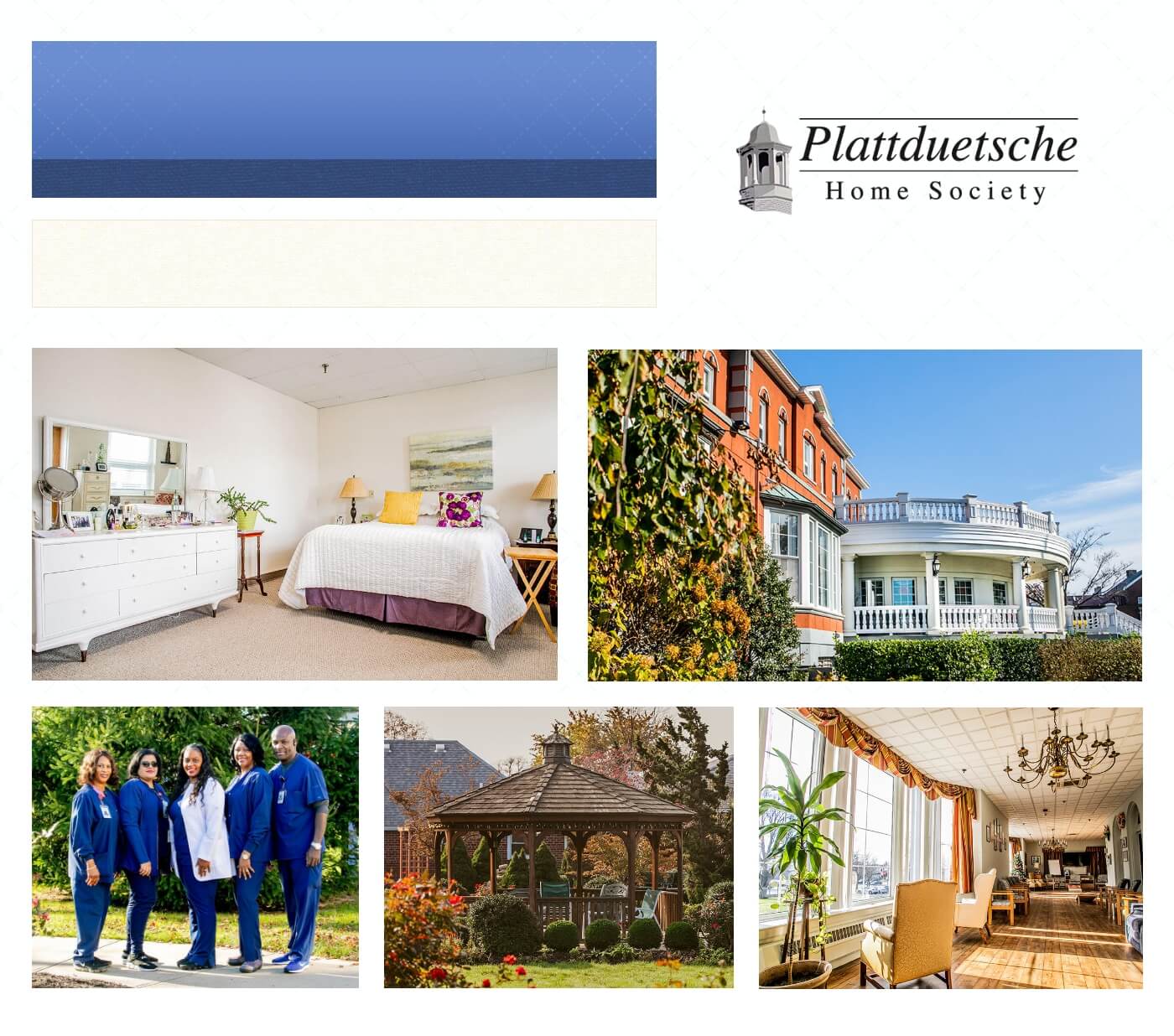
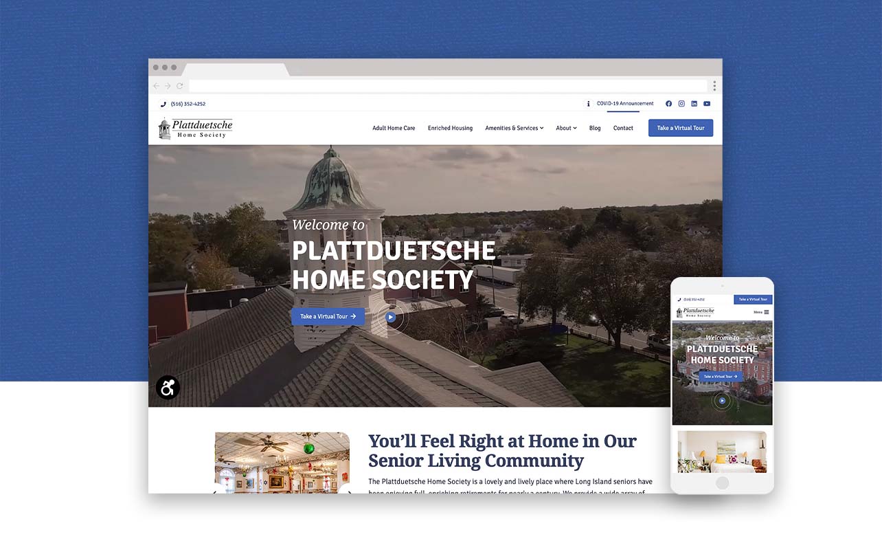
The Plattduetsche Home Society is a senior living housing complex located in Nassau County. Their Adult Home units and Enriched Housing apartments are of various sizes – including studios and one or two bedroom units. Since 1923, the Home Society has been helping Long Island seniors live a full, happy and healthy retirement.
Overview
The Project
- Responsive Web Design & Development, Marketing Designer
- 11 Pages
Team
- Fat Guy Media
- Web Designer
- Account Manager
- Content Writer
- Sales
- Client
Year
- 2020
My Core Tasks
Discover & Define
- Sitemap
- Research: Competitors, Brand Assets,
Design
- Moodboard
- Wireframes
- Graphics Creation
Implementation
- Live Build
- Browser & Responsive Testing
My Primary Toolset
- Microsoft Word
- Microsoft Excel
- Teamwork
- Adobe: XD, Photoshop, Illustrator
- HTML
- CSS
- WordPress
- Google: Analytics, Tag Manager, Search Console
- 3rd Party Extensions
Before
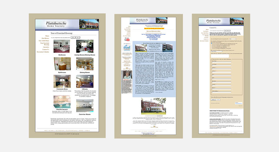
The Challenges
Definitions
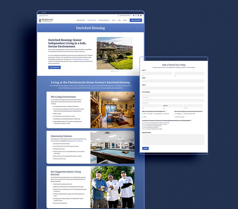
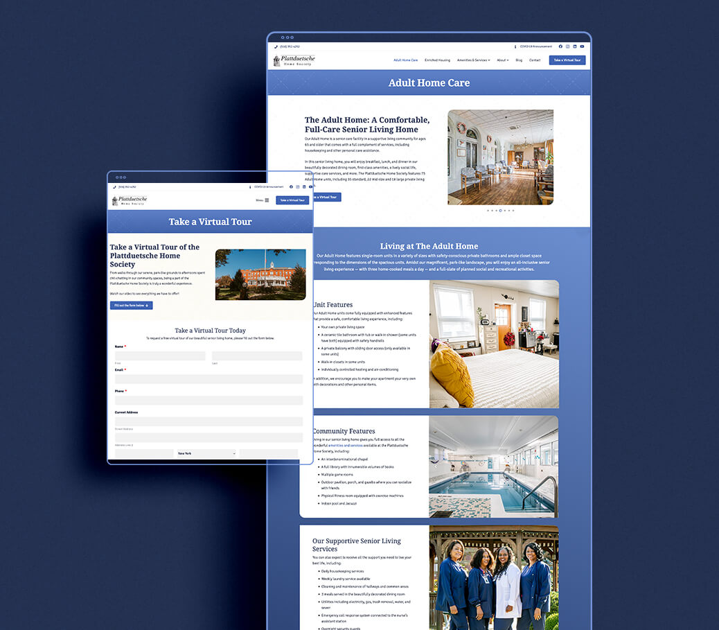
Clearly defining the types of locations that exist at Plattduetsche internally, then producing ways to define them to the public through their differences for ease-of-understanding.
Virtual Tour
Developing a technical solution in order to send a private Virtual Tour video to users who submit a form, in order to narrow down leads of interest.
Web Brand Creation
As we were starting from scratch with a digital visual identity, the team had to work together with the Plattduetsche Home Society to make sure the visual message was on target for their goals as well as approachable to their users.
The Reasoning
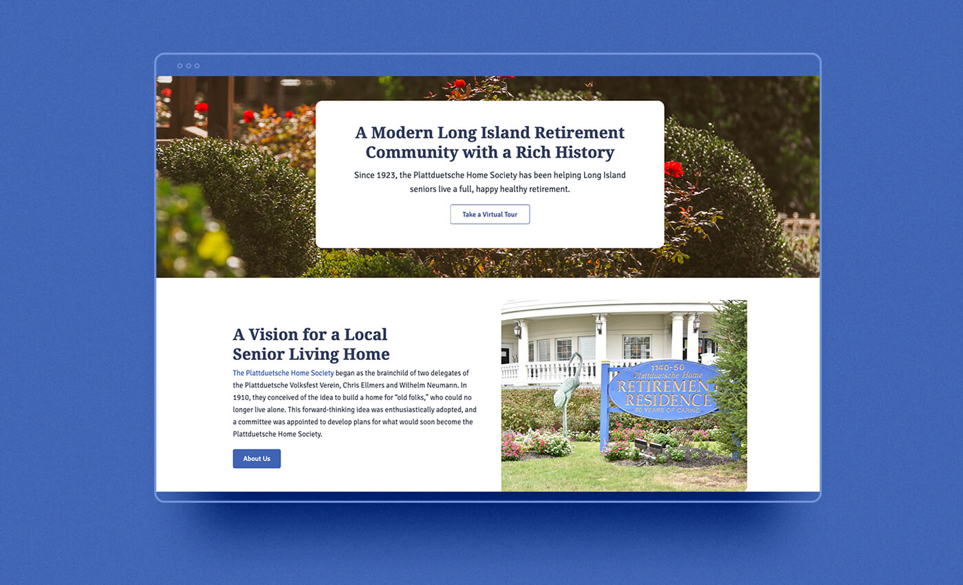
- Creating a web brand identity for Plattduetsche and showcasing the home society through visual imagery, clear layouts, and color blocking to convince users to reach out to the client
- Convey a friendly and welcoming atmosphere for potential residents to envision themselves living their lives there
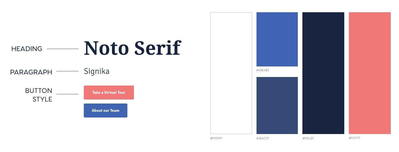
Typography, Color Scheme, and Button Styles
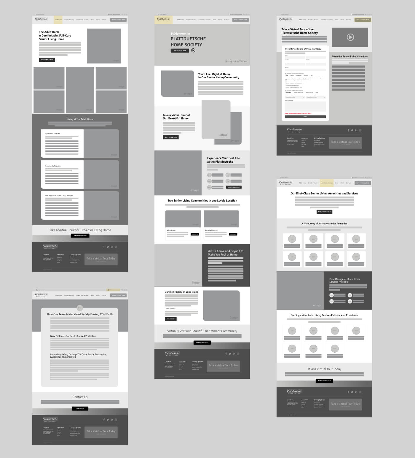
Desktop Low Fidelity Wireframes
The Solution
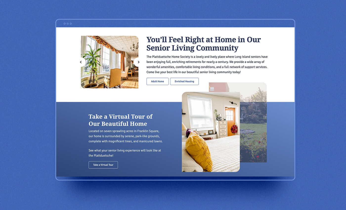
- Typography: Serif header with a sans-serif body choice. This conveys the historical presence of the organization but with modern sensibilities.
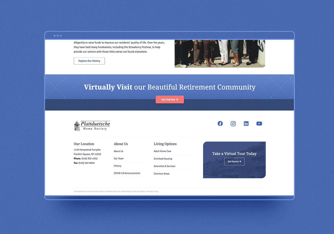
- Colors: White and blue being the core colors with accents of a subtle tan and pink call-to-action to further stand out.
- Layout: Clear hierarchy was established by creating an overall focus of curved edges within assets, a grid structure, along with the layering of elements for users to follow.
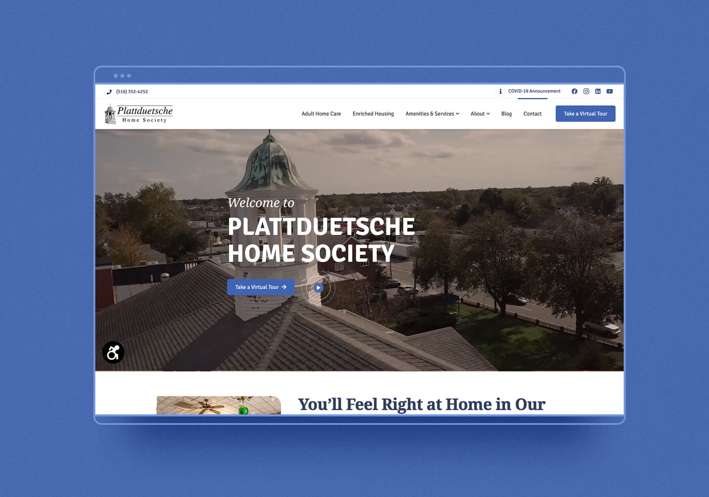
- User Flow: Throughout the website, the values and benefits of living at Plattduetsche have been displayed at its core, with a general overarching focus on call-to-action buttons that lead the user to the Take a Virtual Tour page. From here, they would be able to gain access to a video tour once they filled out the form.
The Results
The client was ecstatic with the results of the project. With users who filled out the Virtual Tour form, many of them have them taken guided in-person tours of the facilities.
Analytic Goals Data:
March 2021 – September 2021
Users: 7.6K
Sessions: 9.1K
Bounce Rate: 1.16%
125+: Virtual Tour Form Leads
Virtual Tour Page: 2nd highest trafficked page
